|
查看: 2793|回复: 10
|
一个不能不知的日本 design firm - Wonderwall Inc(更新中)
[复制链接]
|
|
|
无意发现这个设计公司,所以从它的official website 找一些设计案例跟大家分享。
这个设计公司专长于店面设计, 希望能带给大家一些设计启发。
Wonderwall Inc

2000 Established Wonderwall Inc.
1999 Disbanded H. Design Associates.
1992 Established H. Design Associates.
1990 Became independent.
1966 Born in Okayama, Japan.
* The firm is best known for designing A Bathing Ape's "BUSY WORK SHOPs"® in Japan, London, New York and Hong Kong.
* Believes in breaking boundaries, and he is on a continual search for new ideas.
* When designing retail spaces, not only does Katayama address all the elements of the interior, such as lighting, materials, and proportions but he also considers the actual experience of shopping.
*With restaurants and office spaces, while the actual design may be a crucial element, the interiors are not complete to him without achieving comfort and function.
*Conceiving an interior is about producing a total concept, and his intentions are to create an environment that would touch the subconscious of the consumer and occupant.
(未能翻译,敬请见谅)
设计案例一
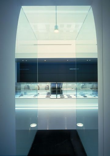
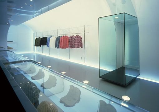
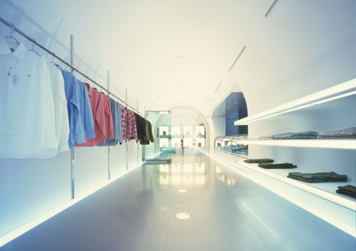
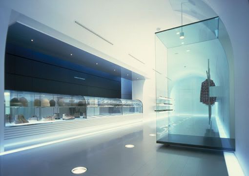
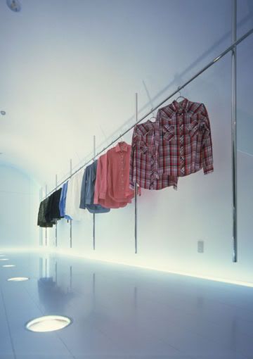
"BUSY WORK SHOP" ® SHINSAIBASHI Boutique / Shinsaibashi,Osaka / 1998 设计概念: By connecting in one curve, the concept of wall and ceiling disappears and a tunnel is created.
The only lighting comes upward from lights embedded in the floor.
设计案例二
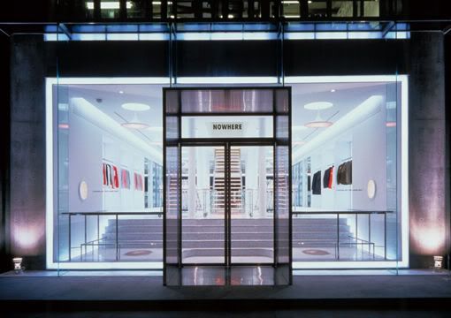
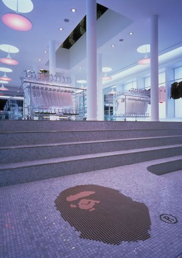
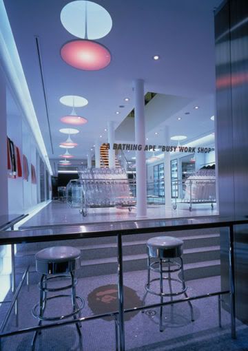
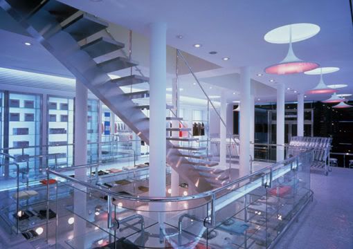
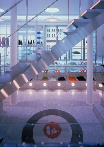
BAPEXCLUSIVE Boutique / Aoyama, Tokyo / 1999
设计概念: A mischievous idea is materialized in this space where apparel is
displayed in the space/function designed for a delicatessen.
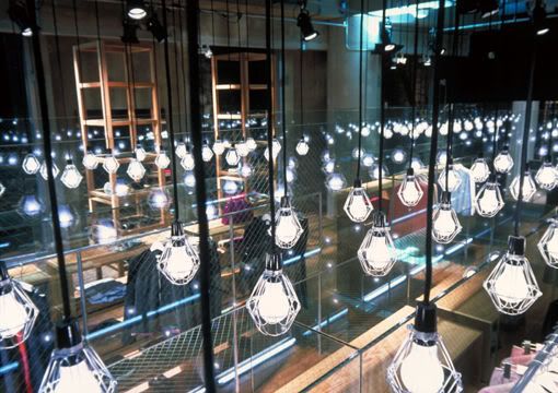
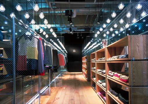
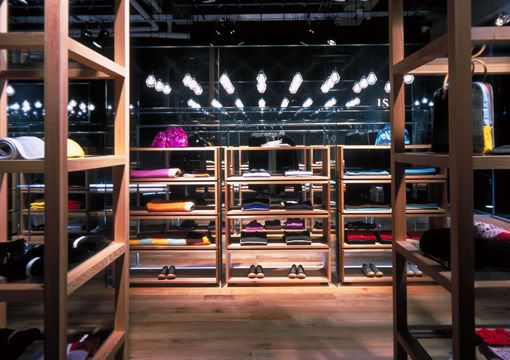
设计案例三
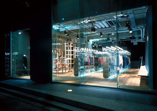
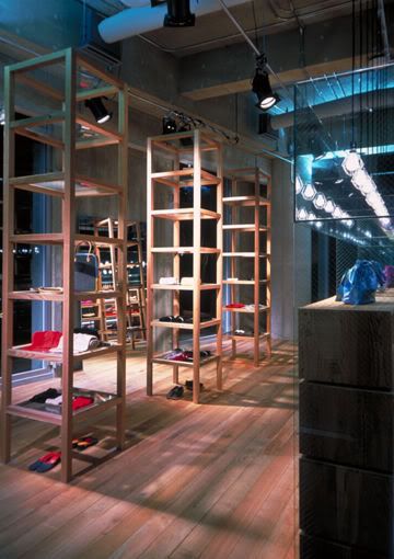
sunao kuwahara Boutique / Daikanyama, Tokyo / 2000
设计概念:An experimental feel is created by designing the space
with only 100 ordinary light bulbs hanging
down from the ceiling.
设计案例四
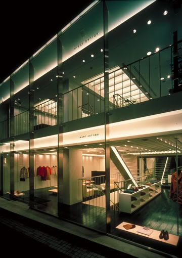
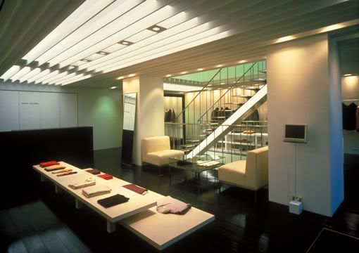
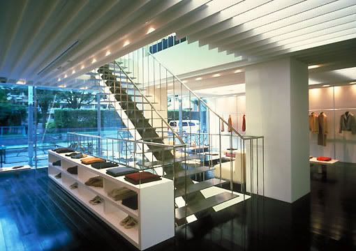
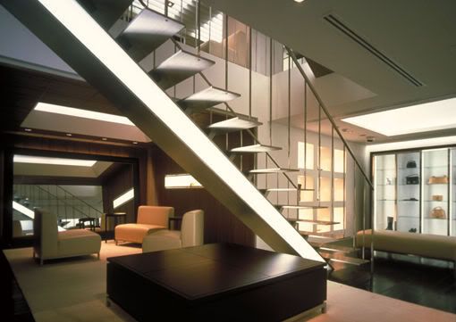
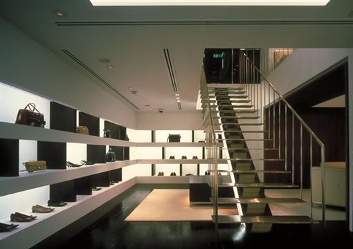
MARC JACOBS Boutique / Aoyama, Tokyo / 2000
设计概念: With the structure of apparel on the first floorand shoes on the first basement, stairs are placed as a symbol to define the space. By not over-designing the space luxurious atmosphere is created.
设计案例五
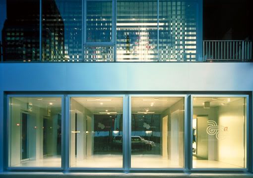
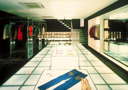
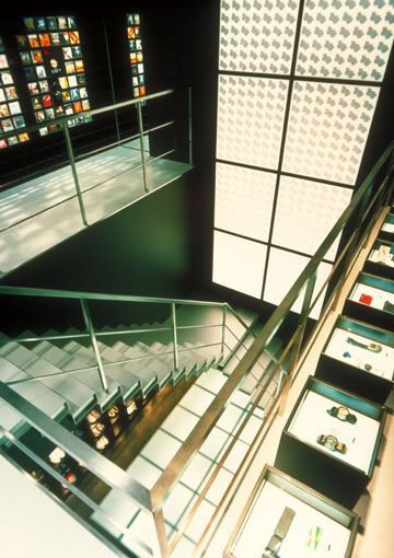
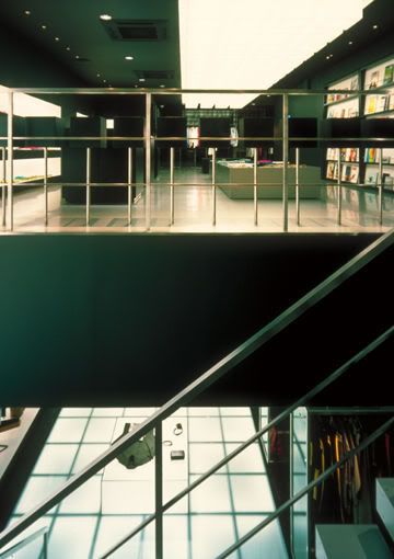
And A Boutique / Aoyama, Tokyo / 2001
设计概念: With the 80's as a theme, the shop is structured in cubes, eliminating curves and using black monochromatic coloring. The shop front is covered with glass and the entrance is placed on the side. This is a new idea using a closed facade as a corridor.
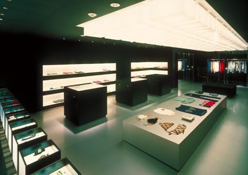
[ 本帖最后由 sashawong 于 15-3-2008 12:49 AM 编辑 ] |
评分
-
查看全部评分
|
|
|
|
|
|
|
|
|
|
|
 发表于 15-3-2008 01:12 AM
|
显示全部楼层
|
|
|
|
|
|
|
|
|
|
|

楼主 |
发表于 15-3-2008 01:17 AM
|
显示全部楼层
|
|
|
|
|
|
|
|
|
|
|
 发表于 15-3-2008 07:00 PM
|
显示全部楼层
突发奇想!
我觉得设计很多空间的案子可能比较容易发挥概念。
但如果是很小的空间但很多物品要展示的话,那会不会比较难呢?
不懂各位手头上的案子都是以上的哪一类呢? |
|
|
|
|
|
|
|
|
|
|
|

楼主 |
发表于 15-3-2008 07:58 PM
|
显示全部楼层
我比较少设计commercial 的。。。之前的都是空间比较小的  |
|
|
|
|
|
|
|
|
|
|
|

楼主 |
发表于 16-3-2008 11:49 PM
|
显示全部楼层
|
|
|
|
|
|
|
|
|
|
|
 发表于 2-4-2008 02:00 PM
|
显示全部楼层
很好的分享。。。。。。还有吗?
bar or lounge 的漂亮室内设计? |
|
|
|
|
|
|
|
|
|
|
|
 发表于 2-4-2008 05:41 PM
|
显示全部楼层
很不错的设计概念, 喜欢设计案例8, 在DISPLAY方面很有创意 |
|
|
|
|
|
|
|
|
|
|
|

楼主 |
发表于 2-4-2008 08:09 PM
|
显示全部楼层
原帖由 wa1 于 2-4-2008 02:00 PM 发表 
很好的分享。。。。。。还有吗?
bar or lounge 的漂亮室内设计?
谢谢。。。还有啊。
我会post 一些关于bar or lounge的设计  |
|
|
|
|
|
|
|
|
|
|
|
 发表于 12-4-2008 09:12 PM
|
显示全部楼层
MARC JACOBS
和
BAPEXCLUSIVE
我都有去过,原来是这家设计的。 |
|
|
|
|
|
|
|
|
|
|
|
 发表于 12-4-2008 09:30 PM
|
显示全部楼层
之前我在学院做project的时候,就是被这间ID FIRM启发我的灵感! |
|
|
|
|
|
|
|
|
|
| |
 本周最热论坛帖子 本周最热论坛帖子
|